After more than seven years, our company embarked on a major webstore upgrade, migrating from the legacy LUMA theme to the modern Hyva theme on Magento. I led the end-to-end UX/UI transformation, collaborating with Balance (our agency partner), internal stakeholders, and technical teams to deliver a modern, accessible, and high-performing digital storefront.
Problem
- The webstore was outdated, slow (especially on mobile), and no longer met user expectations for usability, accessibility, or visual appeal.
- Navigation, product discovery (search, Product listing, Product details), and checkout flows were cluttered and inconsistent, leading to high drop-off rates and user frustration.
Process
- Stakeholder Engagement: Attended and facilitated numerous meetings to gather requirements, validate designs, and align features/functionality with business and technical constraints.
- User Research: Incorporated insights from surveys, interviews, and ContentSquare user behavior analytics to identify pain points and opportunities.
- Wireframing & Prototyping: Led the creation and iteration of new wireframes for all major flows (navigation, Product Listing page, Product Details page, checkout, account management), ensuring brand consistency and enhanced UX.
- Validation: Collaborated with Balance and internal teams to validate designs, address technical feasibility, and ensure stakeholder buy-in.
- Documentation: Maintained detailed documentation of before/after states, tracked changes, and ensured all updates were reflected in project boards and knowledge bases.
Solution
Modernised UI/UX: Delivered a visually refreshed, mobile-optimised, and accessible webstore interface.
I led a comprehensive redesign of the web store, modernising both UX and UI to create a more accessible, mobile-first experience aligned with user needs and business goals.
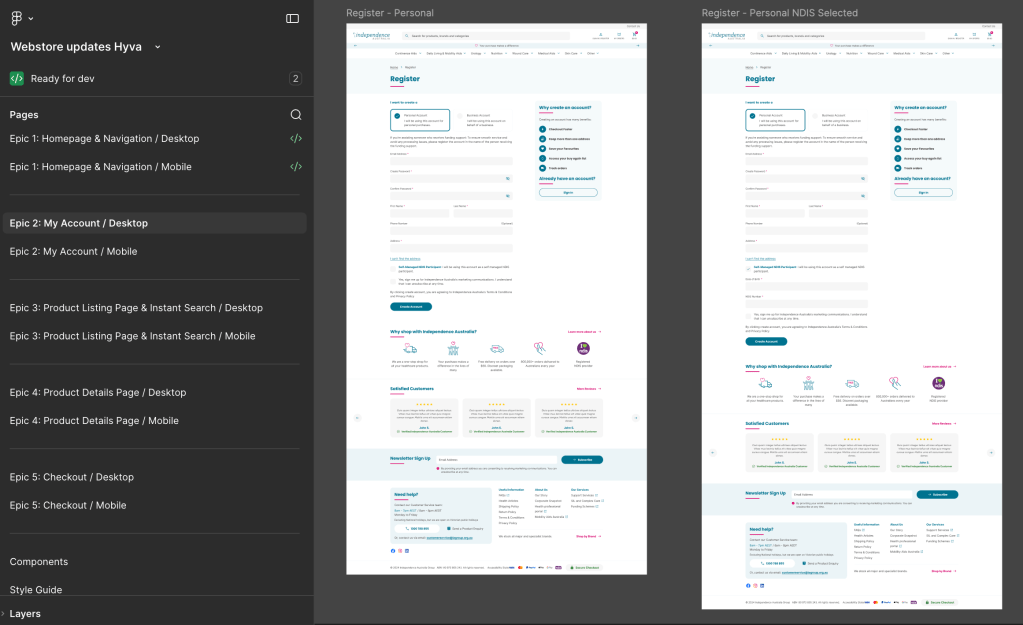
The work was structured around 5 key epics (1.Home page and Navigation, 2.My Account, 3.PDP and Search, 4.pdp, 5.Checkout), prioritising high-impact pain points and areas with the highest drop-off. Rather than focusing solely on visual improvements, the approach combined interface redesign with targeted UX interventions across critical journeys.
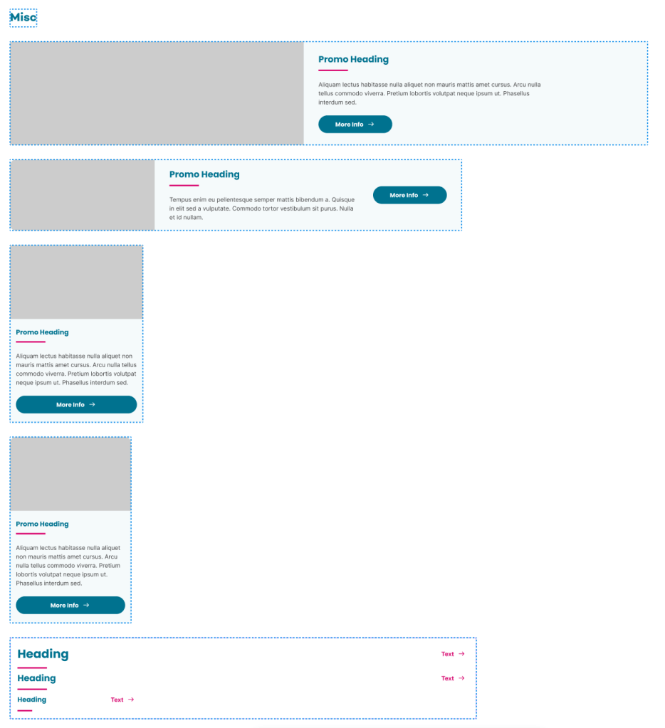
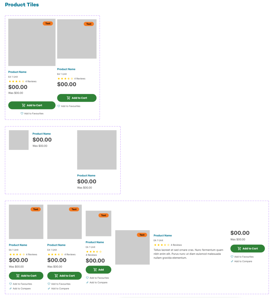
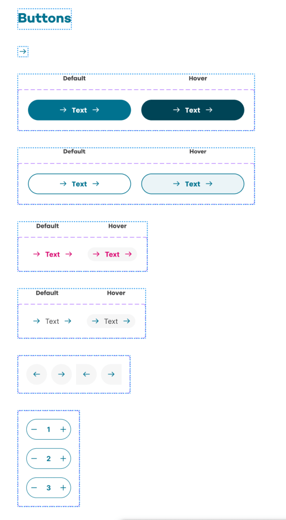
On the UI side, I introduced a refreshed design system including a set of reusable components—such as headers, footers, buttons, and product cards—to ensure consistency, scalability, and faster iteration across the platform.
From a UX perspective, I redesigned key touchpoints where users were experiencing friction, including:
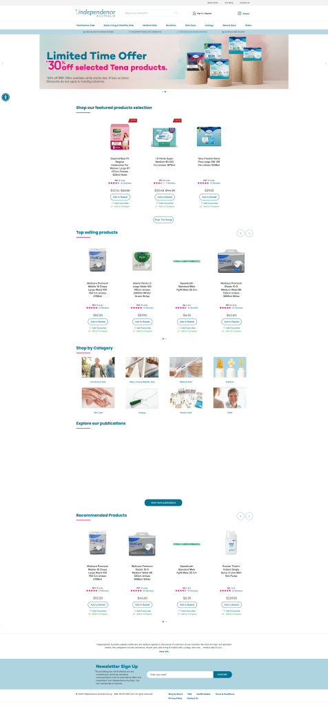
- Product listing pages
- Product detail pages
- Account and registration flows
- Menu navigation
- Favourites functionality
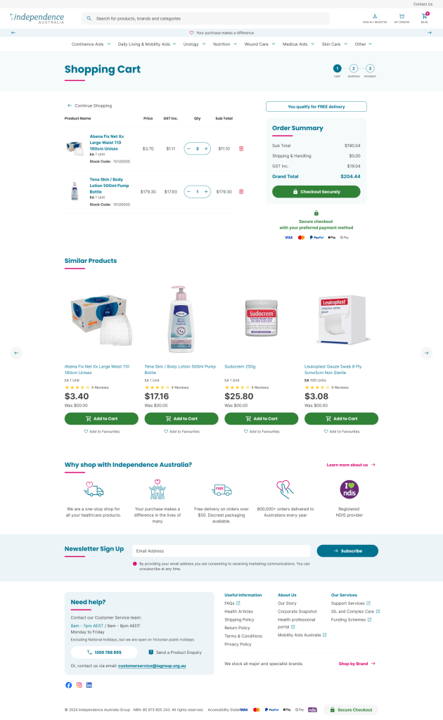
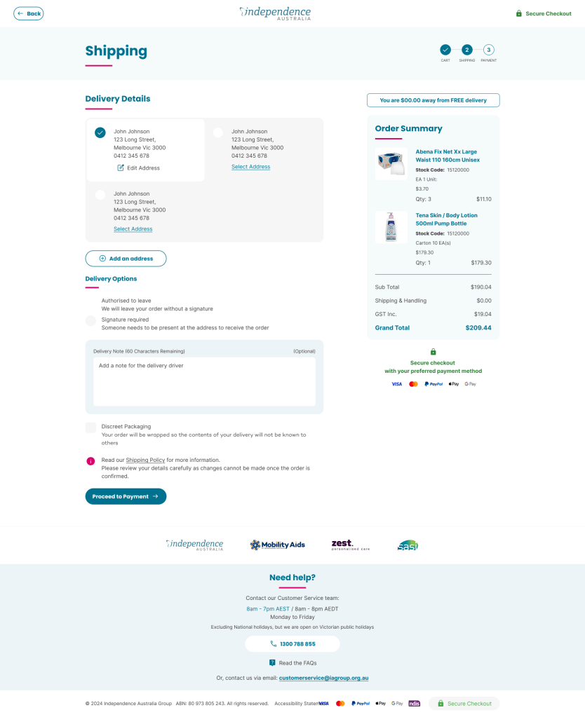
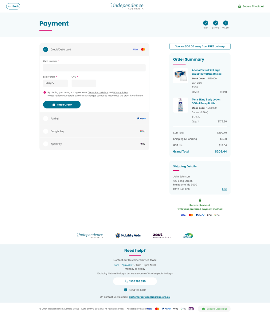
- Checkout process flow
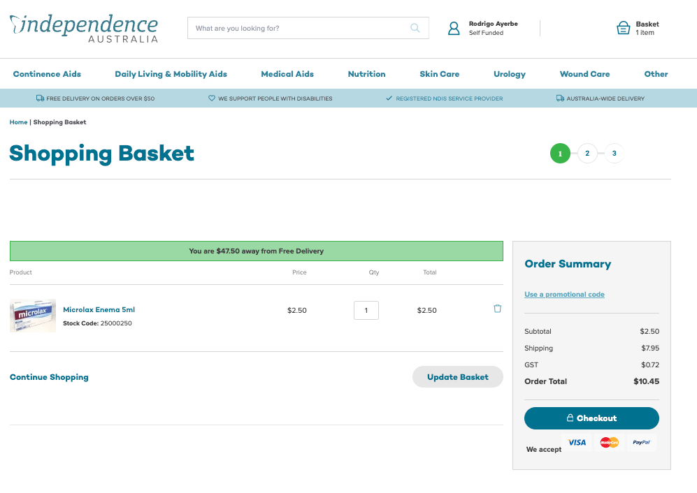
The checkout journey, identified as the primary drop-off point, was significantly improved through a clearer layout, simplified steps, and a more intuitive flow. To reduce friction and support faster conversions, express payment options such as Google Pay and Apple Pay were introduced.
All improvements were designed to support both B2C and B2B users, addressing their different needs while maintaining a unified experience.
Reusable components (Desktop & Mobile)
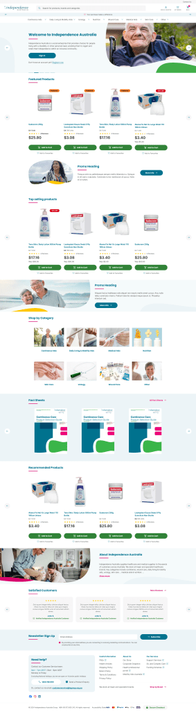
Home Page
Before
After
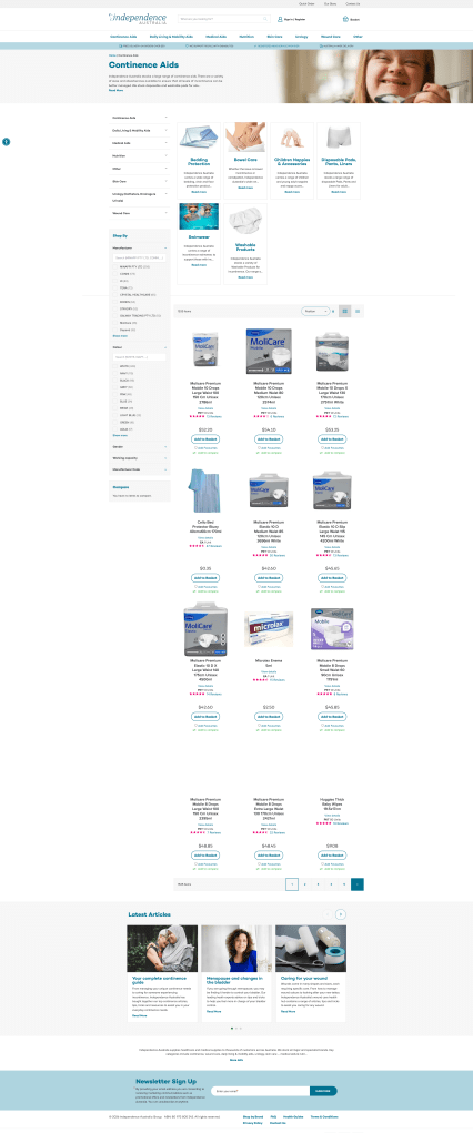
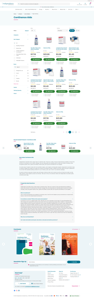
Product Listing Page
Before
After
Checkout flow
Before
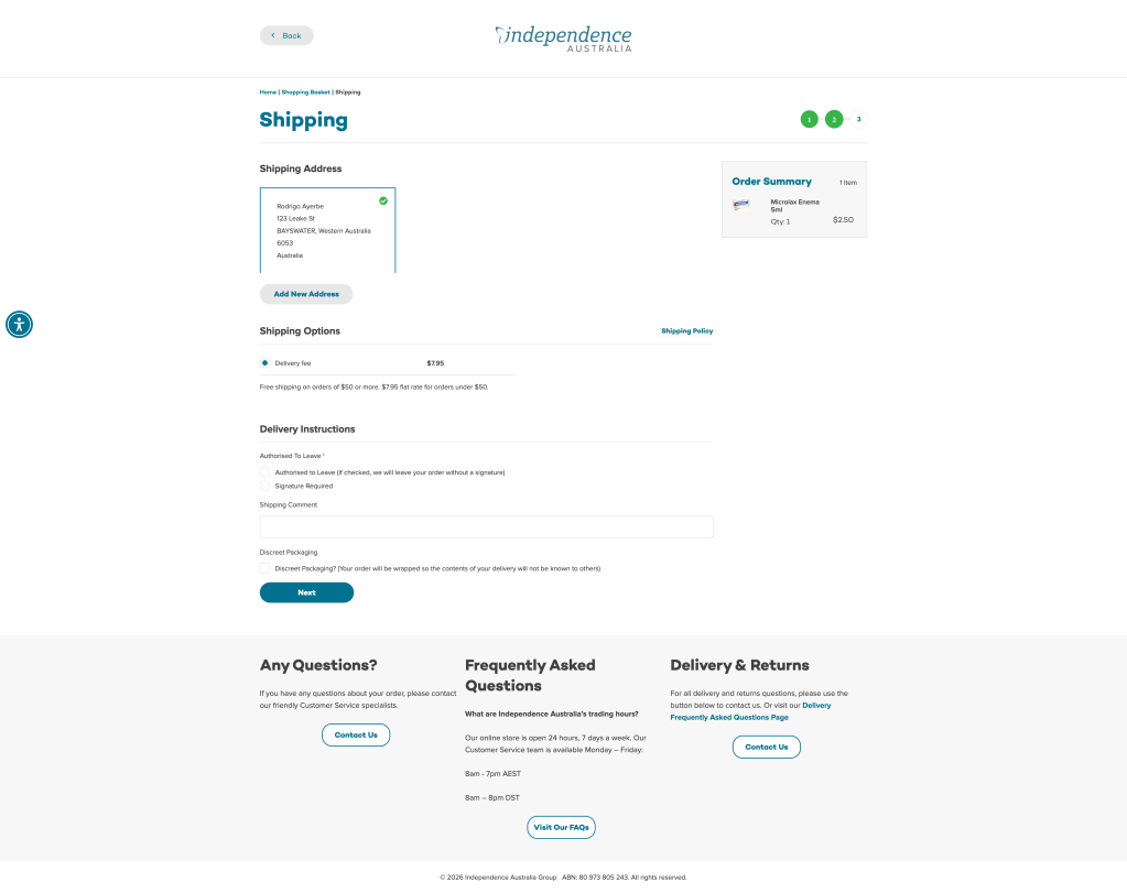
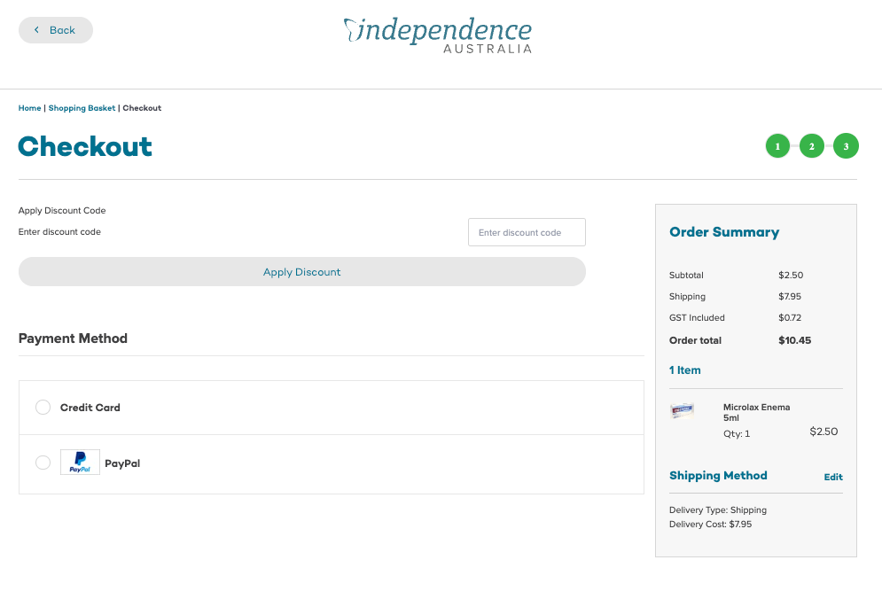
After